
Nomad Jewelry
Nomad is an unconventional jewelry brand inspired by the spirit of exploration, cultural fusion, and timeless artistry. This updated showcase represents the evolution of the Nomad visual identity, expanding into a comprehensive luxury packaging system that celebrates individuality and the modern wanderer.
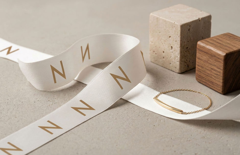
In this refreshed edition, we have deepened the brand's tactile narrative, moving beyond the logo to explore the physical touchpoints of the customer journey, from the weight of the premium cardstock to the delicate texture of branded ribbons and custom monogrammed tissue paper.
Our Services
Brand Identity & Packaging
Client
Nomad Jewelry
Year
2026

Creative Direction & Evolution
The 2026 expansion leans further into the brand’s core contrast: raw heritage vs. refined elegance. Each design decision is grounded in the idea that jewelry is a personal artifact of movement.


Key updates in this suite include:
Tactile Packaging: A focus on sustainable, earth-toned materials that reflect a desert-luxe aesthetic.
The Unboxing Experience: High-fidelity mockups showcasing custom-printed ribbons and debossed jewelry boxes.
Systemic Typography: A refined application of the Nomad wordmark across physical and digital stationery.
Refined Monogramming: Utilizing the "N" mark as a secondary brand pillar through repetitive pattern design.

Premium Packaging
This jewelry packaging for Nomad is designed to reflect a modern luxury aesthetic through its distinctive hexagonal box, clean lines, and muted, stone-inspired finish. The structured geometric form gives the packaging a strong visual identity, while the soft matte texture and neutral color palette create a refined, understated look that feels both contemporary and timeless.
Subtle embossed branding and minimal typography keep the focus on material and shape, reinforcing a premium, design-led approach. Inside, the cushioned interior protects while elevating the unboxing experience, making the packaging not just functional but an integral part of the brand’s storytelling.


